The Waste Land
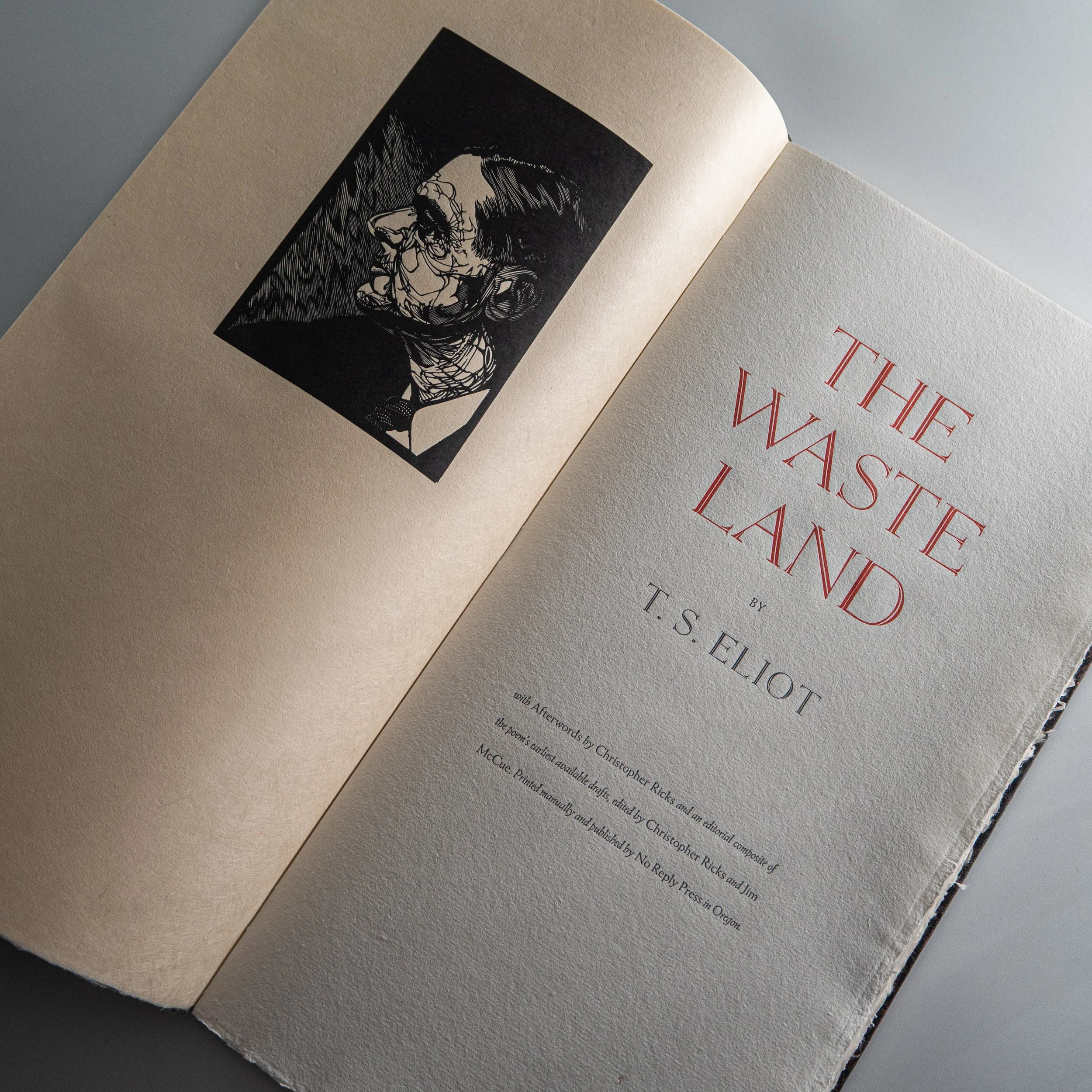
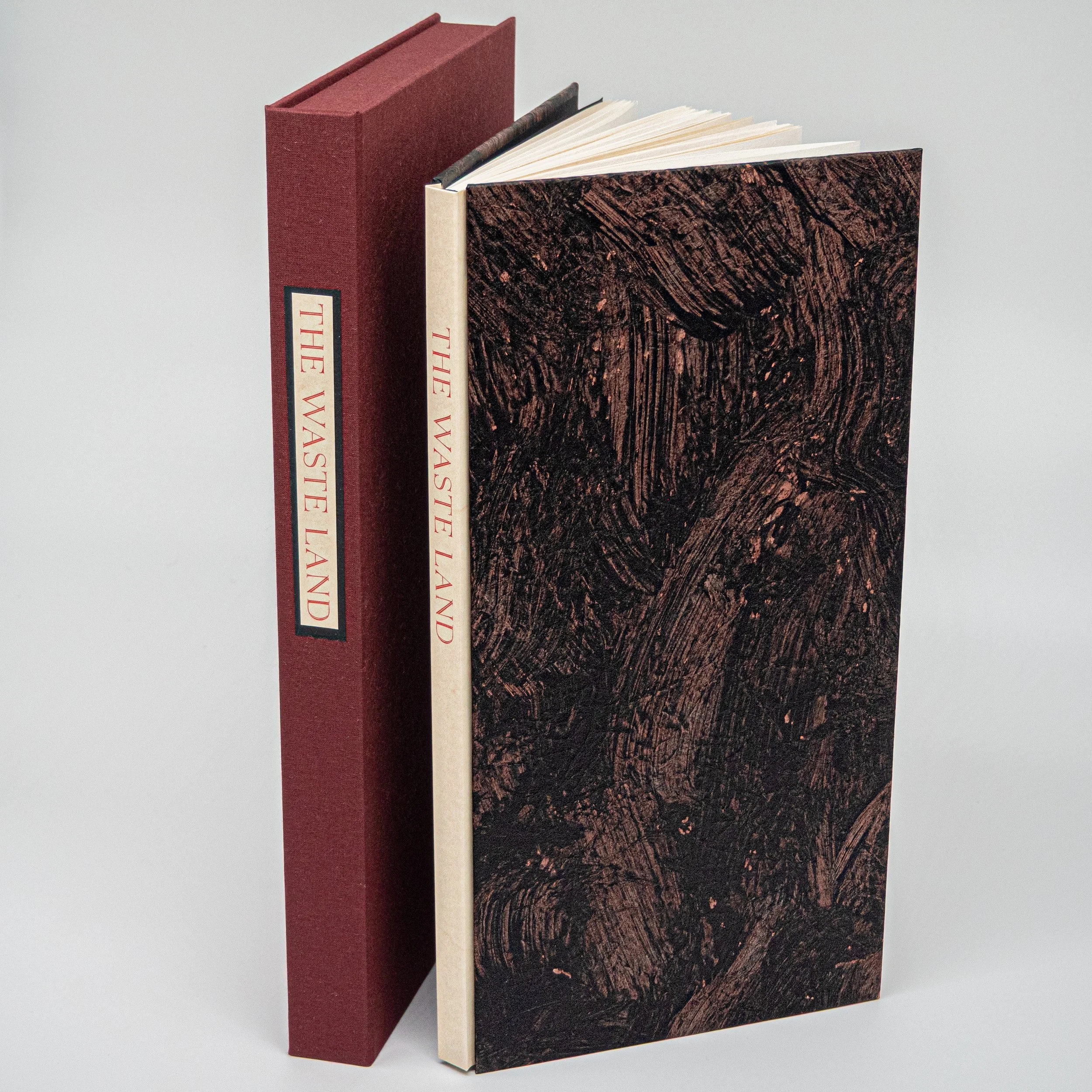
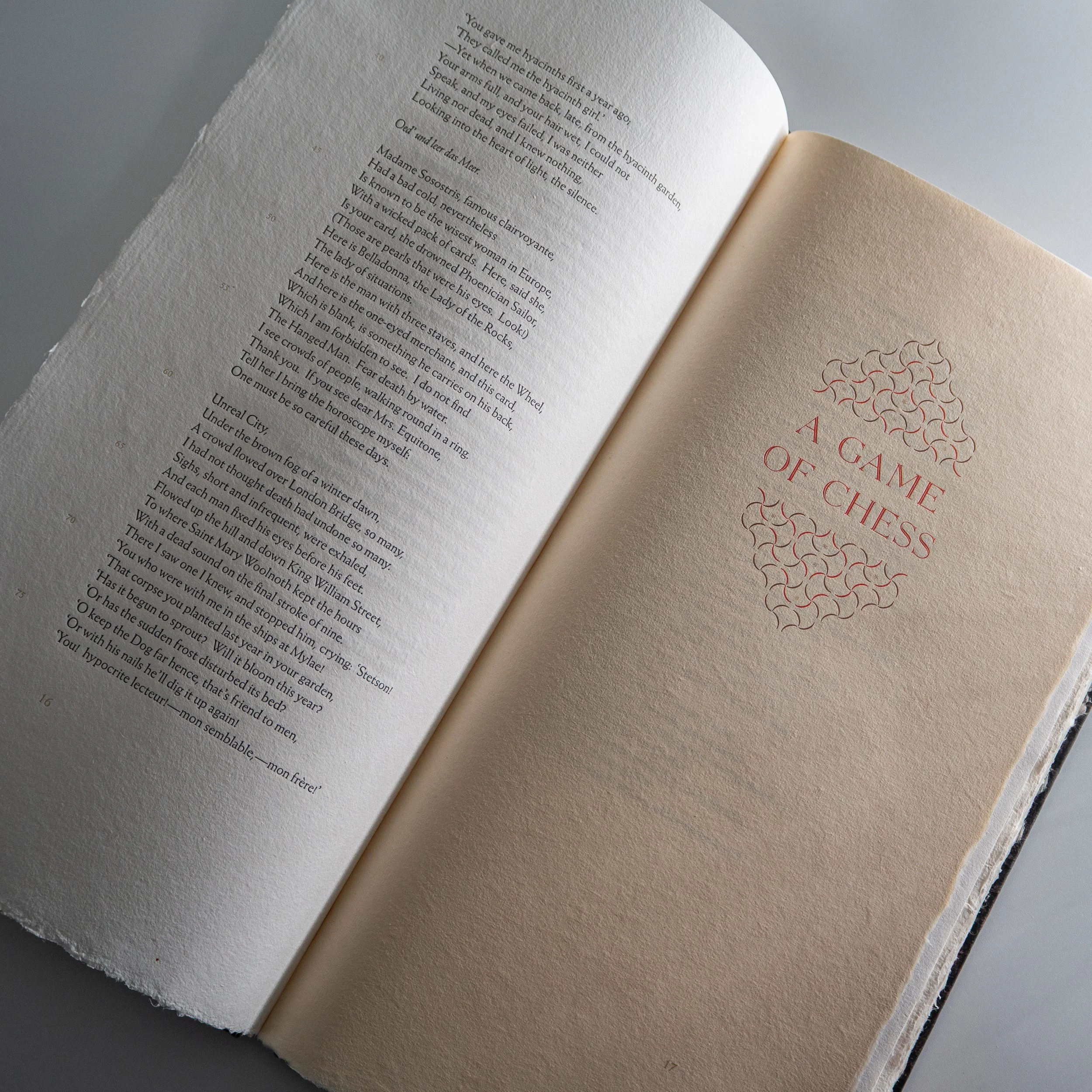
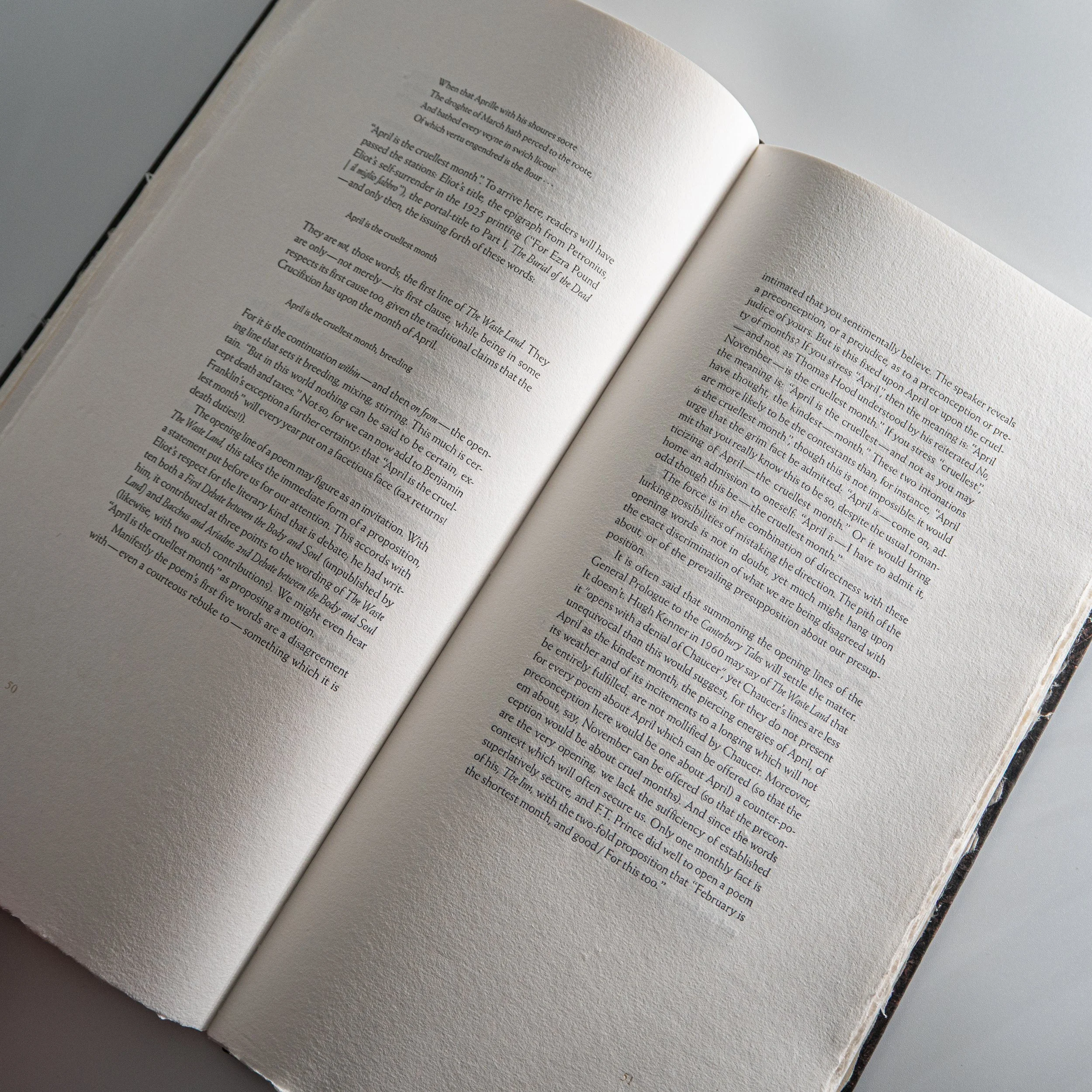
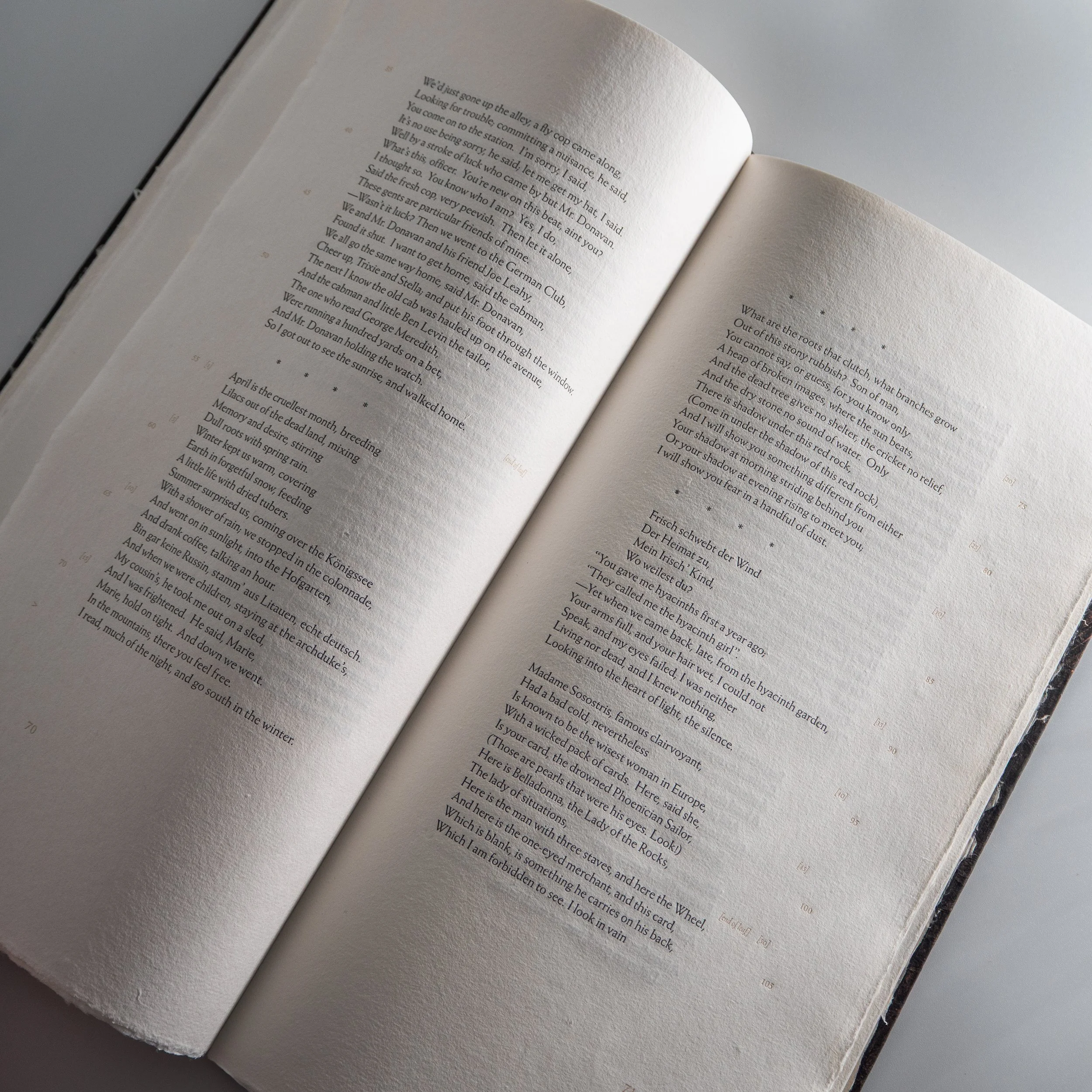
I am writing on the fifth anniversary of the delivery of my Vandercook proofing press. It’s fitting that The Waste Land’s completion marks five years of my being a professional bookmaker. It is by far my most ambitious edition, and it is certainly my finest, but I am most excited about the progress it represents and what that progress means for the future of the press.
Here is a short commentary on the edition, followed by some reflections and a “What’s next?”
This book contains four parts:
First, the poem itself.
This is not just the text of the poem, but rather the text of the poem which we believe should be considered authoritative. There are many versions of the text out there, each with subtle differences. This text represents what Christopher Ricks and Jim McCue, the world’s two foremost editors of Eliot, consider closest to Eliot’s intention, including dozens of small but substantial “corrections” and even an entire line which is often omitted in published versions.
Second, Eliot’s own notes to the poem.
These were written at the request of his first American publisher and are controversial. Many initial readers thought that they were an elaborate prank. They are not — but neither are they entirely not not. However they are read, they are an essential part of the poem’s history.
Third, Christopher Ricks’ Afterwords to the poem.
This essay was written at my request to celebrate the poem’s centenary in 2022. They contain what I consider to be a definitive verdict on this most important of literary masterpieces. We are unlikely to ever have a reader of Eliot to match Ricks’ stature or precision.
Fourth, and perhaps most excitingly, an Editorial Composite of the poem’s earliest drafts.
Christopher and Jim spent a decade bringing together the earliest draft material of The Waste Land. Importantly, they posit four “interludes” between the five parts of the poem. The resulting Editorial Composite with its interludes is over twice the length of the published poem, and is published here in full for the first time.
Exploring these drafts is endlessly fascinating to me — that “Unreal City” was once “Terrible City” or that the entire poem itself was once titled “He do the police in different voices” (an interesting elided umbrella whose shade is still everywhere on the eventual poem). It’s splendid to see the nascence of a Great Work, seeing that it was not always entirely great. Plenty of the original poem deserved to be cut. Most of all, one has the impression of endlessness — of containing multitudes. I’ll spoil Christopher's sublime afterword(s) a bit: he says that this poem is the poem with the greatest capacity ever written. That is, it contains and can contain so much.
The making of the book…
The text of this edition has been meticulously considered. The preparation of the manuscripts and typesetting alone took nearly two years. We care deeply about fidelity to the poem and to the drafts even when, practically speaking, it makes little experiential difference to the reader. For one small example, take the end of line 253 of the Editorial Composite: “despair —”. Unlike its neighbors, there is a space between the word and the dash. And not a full space, a half space. Printing was held up for a day so that we could confirm and re-set this easily overlooked quirk. The book abounds in decisions and revisions, and, even so, there are sure to be flaws. However, while there are many worthy editions of The Waste Land out there, I do not think any has been quite so editorially ambitious as this one, nor any who have cared so deeply about fidelity and precision.
There was a tension in the making of this edition between the book as an art object and the book as an academic reading object. I wanted to do away with all the academic apparatus attending our work — the line numbering, the references, even perhaps Eliot’s own notes. Christopher argued to keep them, and he easily won the argument. While we have kept much of “the apparatus” at bay, it is still a serious resource, despite its being an art object.
As the finished manuscript came together, I felt dread at the coming task: How to turn this sprawling masterpiece into a fitting book?
I wanted this book to feel neither exactly Western nor Eastern, drawing elements of various design languages together. I wanted, most of all, for the book to feel scriptural, like a religious text to be drawn out and read reverentially. This is how I read The Waste Land, as scripture in the literary religion. “Make literature your religion:” this was Chimamanda Ngozi Adichie’s command in one of my earlier editions. I have tried to follow her advice.
At the same time, I wanted a design language that embraced the poem but didn’t smother it. I held back some of my maximalist instincts and, ultimately, I hope the book is streamlined and clearcut, despite its ornamentation and elaborate text. For a multiyear project there is always the risk of putting on one too many ornaments and causing the tree to fall over. I hope I have been sufficiently restrained…
The making of this book coincided with my study of the Allen Press. I was inspired by the Allens’ approach to printing and typesetting. I loved, especially, how they did not beat their wonderful handmade papers into submission, but rather allowed the type to interact naturally with and within the flurry. I like the distinctiveness and warmth of their designs, the boldness of their textures and the lavishness of their colors. I think the influence is clear: the book owes something to the Allens.
My workshop’s modus operandus is to lean into the possibility of handicraft. If a machine can do it, we don’t, and if a machine can’t do it, we do. Nothing about this book is machinable — each paper used, if somebody attempted to run them through, would break the million dollar machines of industrial bookmaking.
Christopher and I both care immensely about preserving a poem as intended in print. This means that the constraints of the physical medium should not impose upon the poem. For example, forcing a line break where one does not exist in the poem. For another, splitting a verse passage (“stanzas” in layman’s terms) across pages, giving the impression of a break where none exists. The format of this book was dictated from the start so that no line is broken, and that verse passages end only where a blank line can be rendered as intended, either mid-page or at the end of a page. This is, so far as I can tell, the first edition of The Waste Land ever to preserve the poem’s formatting in this way. This led me to a tall (15’’) but somewhat narrow (8’’) folio, preserving intact the text itself while maintaining readability and handling. I wanted a monumental but not a cumbersome book — a book that felt grand but could still be held in one hand.
This format helped to dictate the choice of paper. Thick papers would not do well because they lack drape. Thick papers, furthermore, feel inelegant to me. They are quite literally unfine, in that thinner materials are more difficult to make and work with. (Nobody brags about how thickly they can slice prosciutto.) I considered washi at first, but found in my mockups that this tipped the balance too much into Eastern bookmaking. So, after finding the Paper Foundation — a wonderful, fledgling mill in England — and sampling some of their Ingres papers, I realized that a combination of Ingres and washi could be suitable. Ingres, the finesse of the West, and washi, the finesse of the East. Taken together I feel a certain timelessness or placelessness, or perhaps a wandering, which the poem embodies. A German typeface on English paper, beside Japanese washi and Indian ornamentation — all brought together, of course, by an American bookmaker.
With about fifty thousand dollars in handmade paper stockpiled, I began printing. The first week was the worst of my career. These papers did not behave like the papers I had previously used! My first several runs looked fine, but hardly what I had hoped for. (And I heard a ping! in the rope of the Sword of Damocles.) When I first committed to this edition, I had never actually printed more than a small chapbook myself — and that on machine made paper and a small chase. I had a few years under my belt since, but I realized at once that the printing of The Waste Land would be an enormous challenge. I started over, and the edition size reduced from 127 to 100. I am ten times the printer I was now, in large part because of how much I was forced to learn. First and foremost, I learned that the “cost” of handmade paper isn’t in the expense — it’s in the time. To print handmade paper well requires dampening (whereas a Zerkall or a Johannot can be printed nicely dry), requires sorting of weights, and attention to the variability of sheets. In other words, you cannot simply set things up precisely and go, but must constantly change your printing to accommodate the paper shifting beneath you. The amount of time I spent printing The Waste Land is probably as much as my next five editions combined. The slow sheet-by-sheet approach — essentially, taking a handpress approach — was a gratifying experience. I don’t particularly like the work that comes off handpresses; I much prefer what a proofing press can do. However, there are certain circumstances — combinations of paper, type, ink, time — where a handpress outshines a proofing press in my eyes. (To be clear: the edition was not printed on a handpress, but a proofing press modified to behave more like a handpress.) I found that taking the strengths of a proofing press (the precision and control) and the strengths of a handpress (the slowness and the careful consideration) together resulted in printing of which I could be proud. Furthermore, it opened new avenues for exploration in my printing practice.
And I printed The Waste Land in a different style than my usual. While I usually take a “gentle but deep” approach to letterpress, this was impossible with this paper. Besides, I had wanted something a little more classic — something where you can almost taste the metal with your eyes. So “gentle but deep” became “hard but shallow” and I am quite pleased with the results — I think the impression and ink feel just right. I am pleased, too, that I could change my printing to accommodate the paper and poem (not a given!). I am pleased to say that printing on handmade paper, while so much more challenging than I anticipated, was such a fulfilling experience that half-or-so of No Reply editions going forward are likely to be on handmade paper, and I have commissioned a new paper, with my own watermark, handmade to my specifications to harmonize well with my printing approach.
The covers I painted myself. I’ve always loved painted boards for their warmth and personality. Each is unique, but all together they form an edition. I approached each cover like its own painting, trying to evoke the feelings the poem conjures for me. One colleague who I showed the covers to early on said, “Ah, perfect — you’ve made fire resemble water, or vice versa.” Of course, fire and water each have a prominent place in the poem. This was not actually my intention, though I am glad for the coincidence. Rather, I wanted something timeless and scriptural — I wanted a cover design that one feels they could fall through, or from which some deity might speak from the far past or the far future... I know, I know: I’ve been working on this book so long that I’ve gone round the bend.
I executed the binding, and made the solander cases, with the help of my extraordinary apprentice bookmaker Claire. Any precision in its execution is entirely hers, and any shortcoming are mine I’m afraid. In the three years that she has been working for me, and on this project, she has developed an extraordinary skill surpassing mine. Happily, she and I are both improving, and we will continue to do so.
Reflections…
I consider this my best book, because it brings together everything I adore in private presswork. It is my most editorially ambitious, my most handmade, the book in which I was most closely involved in every part of the process. It took the most time — as Gaylord Schanilec says, this work is all about time — and it had the harshest disappointments and the most sublime successes. This object represents me of the past five years, age 25 to 30. I am happy now to set it aside and move on.
Strangely, while nearly every element of this book was made by me, this was also the most collaborative edition I have made. The funny thing about being a hand-bookmaker is that nobody ever tells you “No.” Whatever you want — writers are just happy to see their work done up in this way. But much of this book was a tête-à-tête with Christopher, who often told me No or, rather, NO! For example, after reading his astonishing afterword(s), I asked Christopher if the occasion of the centenary warranted the addition of a personal note about the poem – about his now eighty years of reading and re-reading it. He said it did not. “My job as a critic is to notice things about the poem, not to notice things about myself.” I am so grateful to him for entrusting me with his work.
And I am grateful to you. This book was expensive and took a long time. I have tried to repay the kindness of your patience and support by giving it my honest best. Undoubtedly, if I were to start again today, it would end up better, as I have learned so much in the process of making it. Even so, I am so pleased to share it with you.
What’s next for the press?
Quite a few subscribers to this edition are not regular No Reply collectors, so allow me to take a moment to note a few changes to the press which have developed over the time this book has been in the works.
First, this is the last No Reply edition to be made based on subscriptions or pre-orders. Two years ago, I switched to only announcing books when they are finished and ready to ship. This has led to better bookmaking and, I think, a better experience for all. You will never have to wait again for a book from my workshop — when you reserve a book from me, you will see it shortly thereafter.
Second, No Reply has fully transitioned from a “commercial fine press” — wherein I work with a variety of contracted craftspeople — to a traditional private press. I now do everything myself, from the typesetting to the printing to the binding, with the aid of my assistant Claire. I have come to believe that books are most interesting and joyous when made in this way, and I can say from experience that care and time are the keys to excellence. Nobody will care about my books, or give them as much time, as me. As my own skills develop and my talents mature, I hope that books under the No Reply imprint will steadily improve. Improvement, after all, is my only goal.
When I first set out to make this The Waste Land I basically only made chapbooks. I thought that this project would be a one-off “magnum opus” of sorts — in line with my love of the poem. In the meantime I have taken on other quite ambitious projects — The Ethics of Ambiguity and The Death of Ivan Ilyich come particularly to mind — and my thinking has changed. I now see The Waste Land not as a capstone but as a new foundation. While I certainly intend to continue to make smaller and more affordable editions — which can be just as ambitious as larger books — I also want to tackle a grand project every year or two. Looking ahead, I think The Waste Land will be “just the beginning.”